Cancer survival creates a new kind of risk
The first time a hill feels steeper than it used to, it’s easy to blame sleep, stress, or being “out of shape” after everything you’ve been through. But for some survivors, the body is also carrying a quieter change: treatment that helped control cancer may have left small, slow-moving strain on heart muscle or blood vessels. It doesn’t always show up as a dramatic event. More often it looks like stamina that doesn’t come back on schedule, ankles that puff up by evening, or a blood pressure reading that starts creeping higher at routine visits.
What makes this risk feel different is the timing. Many people finish chemo or radiation, get a clear scan, and expect health to move in a straight line toward “normal.” Instead, recovery can be uneven. Weight, activity, and sleep may change during survivorship, and those everyday shifts can stack on top of treatment history in a way standard “heart risk” checklists don’t always capture. The uncertainty can be frustrating—especially when symptoms come and go.
How treatments quietly reshape the heart over time
Sometimes it’s a small mismatch that gets your attention: your legs feel willing, but your breathing tops out earlier than expected, or your pulse seems to jump faster on a familiar walk. Treatments that saved your life can leave behind changes that don’t announce themselves right away. Certain chemotherapies may subtly weaken how forcefully the heart squeezes, while some targeted or immune-based therapies can, in some people, shift blood pressure or trigger inflammation that takes time to settle. Radiation near the chest can also stiffen nearby vessels over the years, making the system less “springy” even when day-to-day life feels normal.
These effects rarely happen in isolation. Recovery often brings long stretches of lower activity, weight changes, and disrupted sleep, and those can nudge cholesterol and blood pressure in the wrong direction. Taken together, the heart may be working against a slightly higher baseline load, which can look like swelling that comes and goes, new headaches with higher readings, or fatigue that doesn’t match your effort. None of this proves a single cause, but the pattern can be worth tracking.
Why standard heart risk scores often miss survivors
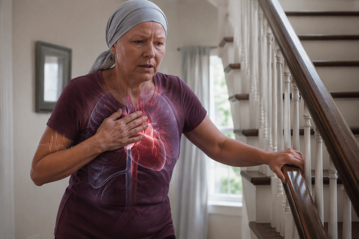
It can feel oddly reassuring when a clinician runs a standard heart risk calculator and the number comes back “low.” Then the disconnect lands: you’re still getting winded on stairs, or your blood pressure is trending up even though your cholesterol isn’t dramatic. Part of the problem is what those scores are built to see. Most lean heavily on age, sex, smoking, cholesterol, diabetes, and today’s blood pressure—useful, but focused on the kind of plaque-driven heart disease that develops in the general population.
For many survivors, the extra risk isn’t neatly visible in that snapshot. Past chemo, chest radiation, or certain newer therapies can leave a slower, more structural strain—stiffer vessels, reduced reserve, or a heart that tolerates stress less comfortably. Those changes don’t always raise cholesterol, and they can show up as “normal” numbers paired with subtly shrinking exercise tolerance. A familiar score may be accurate for what it measures, while still missing what survivorship added.
What the new prediction tool is trying to capture
You might notice the weird mismatch at a follow-up: your labs look “fine,” the risk score looks “fine,” but your walks still take more out of you than they used to. That’s the gap newer prediction tools are trying to narrow. Instead of treating survivorship as a footnote, they try to pull treatment history into the center of the estimate—what you received, how much, and where radiation was aimed—because those details can change how much reserve the heart and blood vessels have years later.
In practice, the goal isn’t to declare that a problem is happening. It’s to flag when a pattern deserves closer attention even if the usual numbers stay calm. A tool like this is trying to weigh “everyday” signals (rising blood pressure, swelling that returns, shrinking exercise tolerance) alongside exposures that standard calculators ignore. It can’t fully separate treatment effects from aging, deconditioning, or weight changes, so the output is more like a better-informed warning light than a definitive answer.
Trade-offs between complexity, clarity, and usefulness

The first time you see a tool ask about chemo names, cumulative doses, and where radiation fields landed, it can feel like it’s turning your story into a spreadsheet. That extra detail is the point—and also the drawback. More inputs can make the estimate more “survivor-aware,” but it also raises the chance of missing information, fuzzy recall, or records that don’t travel cleanly between oncology and primary care. Even when the data are complete, the output can land as a single number that feels precise while still sitting on a wide range of possible futures.
Clarity tends to drop as complexity rises. A simpler score is easy to explain and repeat over time, but it may ignore the way treatment reshaped your baseline. A more tailored model may better match your situation, yet be harder to trust when your day-to-day symptoms are inconsistent—good weeks, then a sudden “why is this harder?” week. The most useful version is often the one that makes follow-up conversations more specific, without pretending it removes uncertainty.
When reasonable choices create confusing new symptoms
It can start with something that felt like a healthy decision: switching to a gentler workout because your joints still complain, cutting back on salt after a higher blood pressure reading, or taking a new medication that finally gets your numbers into a safer range. Then the body sends mixed feedback anyway. A shorter walk leaves your chest tight or your legs heavy. Your weight jumps a couple pounds overnight, then drifts back down. The confusing part is that none of these choices are “wrong,” but they can change what you notice—and when.
In survivorship, small shifts tend to echo louder. A beta blocker can make your heart rate feel oddly capped, which some people interpret as being out of shape. A diuretic can reduce swelling while leaving you feeling flat or lightheaded if the balance is off. Even “doing less” to recover—more sitting, fewer errands—can quietly reduce conditioning, so stairs feel like a symptom rather than a predictable training effect. The same signal can mean different things depending on the week, which is why patterns matter more than single days.
Revising follow-up expectations without chasing certainty
At some point a normal check-in can feel like a negotiation: you want reassurance, but you also don’t want to be waved off just because today’s numbers look tidy. Survivorship follow-up works better when the goal shifts from “prove something is wrong” to “notice if the trend is changing.” That might mean paying attention to how quickly your breathing tightens on the same route, whether ankle swelling is becoming more frequent, or whether blood pressure is drifting upward across several readings instead of one stressful afternoon.
The prediction tool, in that sense, is less a verdict than a way to make the next step less vague. It can help decide when it’s reasonable to repeat an echo, check biomarkers, or simply watch longer—without turning every tired week into an emergency. It can’t eliminate noise: aging, sleep, medications, and deconditioning still blur the picture. But it can support a calmer expectation that “stable” may look like small adjustments, not a straight line back to before.